Articles:
- Contact capture form
- How to add a widget code to your website
- Tracking visits from the landing page through the widget
- Mini landing pages
- Adding a request form (widget) to a Weblium page
- Adding a request form (widget) to the Sendpulse page
- Adding a request form (widget) to a Wix page
- Displaying the Course Program on Your Website
- Adding an Online Chat for Students to the Kwiga Platform
- How to Create a Contact Collection Widget
- Widget Statistics: How to Track Effectiveness
In this section, we will explain how to create a widget: a banner (CTA) and a form for collecting contacts.
In this article:
What is a widget?
A widget is a compact application that is added to a website to extend its functionality. Visually, a widget appears as an interactive block displayed on the screen.
Common widget formats include a form for collecting leads and customer contacts, as well as “call-to-action” banners—for example, a block with graphics and text that encourages a website visitor to register for a webinar, purchase a course, participate in a giveaway, and much more. In both cases, the goal is to obtain contact information from a potential customer for further engagement.
On Kwiga, you are not limited in how you can use a widget. It can be a banner, a promotional offer advertisement, a course teaser, a contact collection widget, or a quick webinar registration form, and much more. Data from the form can be sent directly to the CRM within Kwiga, as well as to other services if you use them to work with clients.
A widget in Kwiga is a universal tool that you can add to any website.
Use cases
Third-party website
You drive traffic to a landing page on your website and want to collect contacts or sell a course only through it. In this case, you add the widget either directly or via a modal window. The client enters their data into the form on your site and, depending on the widget settings, will be redirected either to a payment page or directly to their Kwiga account profile. The user is automatically authorized and does not need to enter additional data on the Kwiga platform.
Possible actions after submitting the form:
• Redirect to the profile of the newly created contact on the Kwiga platform
• Stay on the current website and open the second step of the form: here you can place additional information and a button that redirects to the desired page
• Redirect to the payment page of the selected payment system, with automatic access to the product granted after successful payment
Webinars
During an event, you can display a widget at a specific time marker and for a set duration. The number of displayed widgets is not limited.
Case:
The goal is to attract the maximum number of participants to a webinar. To achieve this, you lower the entry barrier by allowing participants to join via quick registration that does not require entering an email address or phone number. Then, during the webinar, you present an offer and display a contact collection form at the bottom of the screen. This way, you can reach more participants with your offer without losing their contact details.
Courses (in development)
You can add a banner or a contact collection form to any video in any lesson.
Case:
You want to attract new customers to your paid course and you have an introductory lesson available. To avoid losing potential clients during the registration stage before they get to know you, you can make this lesson open (accessible without registration). Then, during the lesson, you display a relevant CTA or contact collection form and convert visitors into your clients.
Creating a widget: general information
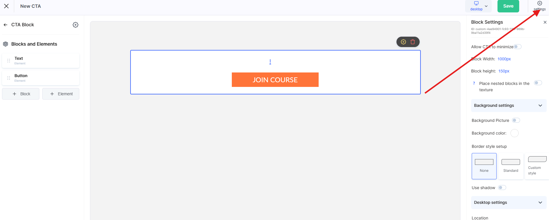
To configure or create a form, go to Settings → Widget (CTA). Created CTAs can be used simultaneously across different websites, webinars, and lessons. In the Kwiga builder, you can create any form or banner consisting of blocks. Each block, in turn, can contain various elements: text, image, button, link, or field.
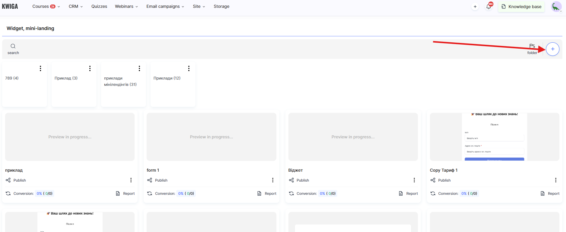
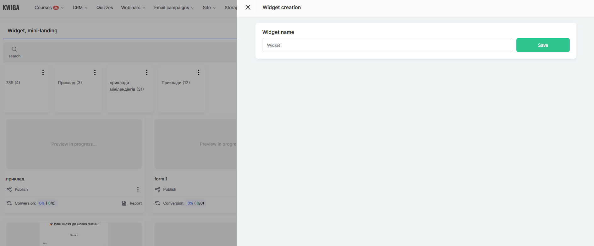
To create a new widget, use the +CTA button.
Structurally, each widget consists of blocks and the elements within those blocks.
Blocks:
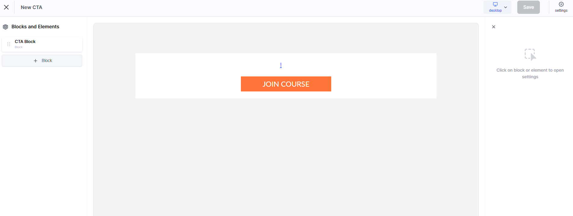
• CTA Block
Use this option if you want to create a Call to Action (CTA). By default, the block contains two elements: text and a button. You can add more elements, modify them, or replace these elements.
• Form
Use this block to collect data from your clients. By default, the form contains two input fields (name and email) and a button to submit the data.
• Custom Block
Start creating your own form from scratch without using predefined templates or presets.
Elements within blocks: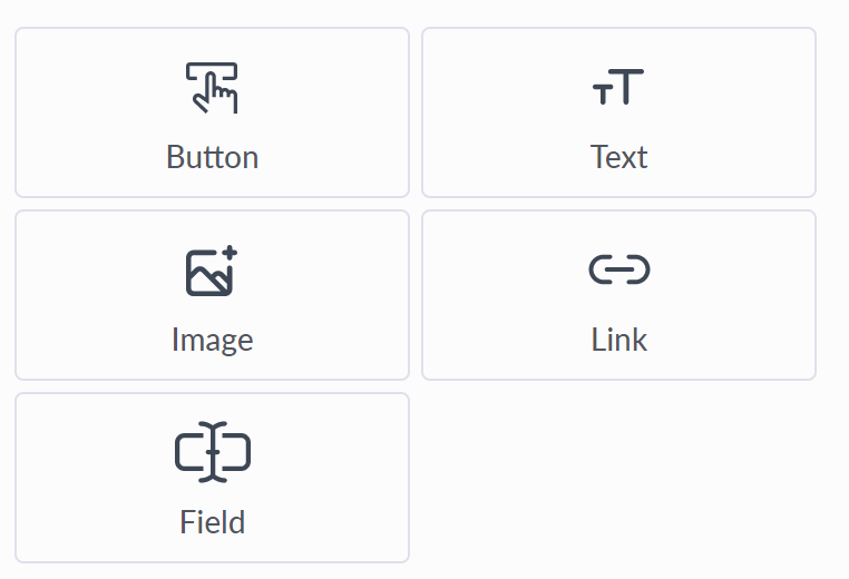
Elements within blocks:
• Button
With a button, you can configure two actions: submitting form data or redirecting the user via a link. When the link option is selected, you can choose how it opens: in a new window/tab or in the current one. A wide range of visual customization options is available, including size, color, hover color, font, border radius, and spacing.
• Text
A wide set of options for customizing text display. It can be used for headings and additional descriptions in forms or banners.
• Image Element
Allows you to adjust the height and width of the image, stretch it to a certain width in %, apply border radius, and configure overlay behavior (text and background) on hover. You can also assign a link to the element on click.
• Link
Lets you specify a link and how it opens: in a new window/tab or in the current one. Additional controls include font, color, and spacing.
• Field
You can add any field to the form that you have set up in your custom fields under Contacts Standard style and appearance settings are available: size, font and color of the input text, font and color of the placeholder, border radius, and spacing.
Additional settings:
-
required field
-
hidden field: some fields can be added to the form but not shown to users. This is useful for adding tags, tracking contact sources, setting the user’s language, or passing other parameters from the form to the CRM.
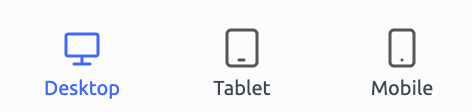
Attention! Remember that each block and element has additional settings for the mobile version (tablets and mobile phones). You can override visual settings specifically for mobile devices.
To switch between different device views, use these control buttons (located in the top-right corner of the control panel).
Creating a widget: contact collection form
To create a new contact collection form, go to Settings → Call to Action (CTA) and click the +CTA button.
If you are creating a form from scratch, add a new Block using the +Block button. In the menu that appears, select Form. In the center of the screen, you will see the form itself, and on the left-side menu you can add or remove elements (the form content), as well as configure the appearance of the form and its elements.
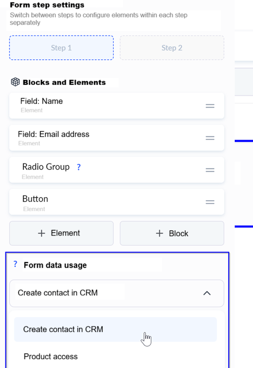
Note that the form can consist of two steps. This is only possible when the “User redirection” option is set to “Stay in the current block”. In all other cases, the form consists of only one step, since after entering the data the user will be redirected according to one of the following flows:
• Redirect to the profile of the newly created contact on the Kwiga platform
• Redirect to the payment page of the selected payment system, with automatic access to the product granted after successful payment
• Redirect to the product page (course/marathon), with automatic access granted
Widget configuration can be условно divided into the following steps:
1. Opening in a modal window
2. Form field setup
3. Data processing logic
4. Visual design
5. Widget code
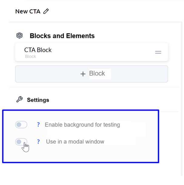
Opening the form in a modal window
If you want the widget to open in a modal window when clicking on an element on your page, go back to the very beginning of the blocks and enable the “Use in modal window” option. There, you can also configure background parameters, modal window style, and spacing.
Form fields
Details about the blocks and elements that make up the widget are described in the section “How to create a widget”.
Add all the required fields to the form. Specify whether a field is required or hidden with a predefined value. Also configure all necessary display styles for the field: font, color, background, borders, and spacing.
Data processing logic
This setting determines what happens with the submitted data and is configured when editing the Form block in the “Form data usage” option.
The following options are available:
• Create a contact in Kwiga CRM
• Grant access to a product
Create a contact in Kwiga CRM
A contact is created in the CRM. If a user with the same email already exists in your contacts, they are redirected to Kwiga and shown a login form. After successful authorization, all fields (except email) that were entered in the form are updated in their contact profile.
You can also specify what happens to the contact after being added to the CRM:
• Stay in the current block: this means the user will be shown Step 2 of the current form
• Redirect the user to their profile on Kwiga
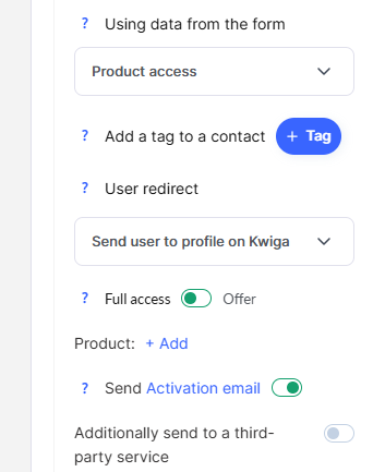
Grant access to a product
You can create a contact and immediately grant them access to a product. If full access is granted or access is provided via a free Offer, the contact receives access to the product and, after submitting the form, is redirected to the product’s presentation page.
If the user needs to pay for the product first, you should specify the corresponding paid Offer.
When a paid Offer is connected, you get the option to set, via the “Immediately redirect to payment” option (enabled by default), whether the user should be sent directly to the payment page of a specific payment system or first redirected to the standard public Offer page on Kwiga.

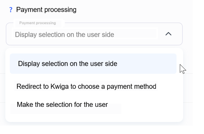
There is also an exception for paid Offers when more than one payment system is connected or when installment payment options are enabled—i.e., when the user needs to make a choice. In this case, the “Payment processing” option appears.
You need to choose how the payment will be handled from the available options:
Redirect to Kwiga to choose a method
After submitting the data and creating a contact, the user will be redirected to the standard Kwiga payment page for the Offer.
Display selection on the user side
The choice of payment method and payment system will be made within the widget. After the user selects a method, they will be automatically redirected to the payment system page (bypassing the standard Kwiga page).
Make the selection for the user
You will be prompted to specify which payment system and method the customer will use. After submitting the form, the user will be automatically redirected to the payment system page.
Also note the “Send activation email” option. It works the same way as when adding a contact on the platform.
Visual design
Each element or block can be customized flexibly: font, text size, spacing, border radius, background, and borders. You can also set overrides for mobile devices.
Widget code
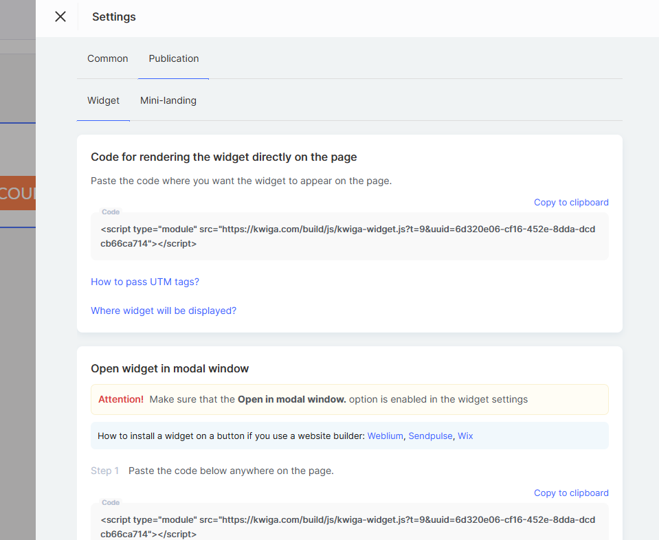
After configuring the form, you need to obtain the widget code to place it on your website.
Attention! Adding a widget on the Kwiga platform (for webinars and courses) does not require any code.
Save all changes to the widget and go to the section where all created widgets are listed (Settings → Call to Action (CTA)).
On the widgets list page, click “...” and select “Widget code”, then follow the instructions in the modal window that appears.


Didn't find the answer? Contact the support service via online chat or Telegram