Articles:
- Access control
- How to disable login through social media
- How to set your project logo (preview) for messengers
- Changing the project (cabinet) name and other public settings
- Adding your offer to the Kwiga platform
- How to connect an additional project
- How to set a specific language for a page on Kwiga
- Notifications received by students
- Changing the password and login settings
- Changing personal information
- Sender settings and reply address
- Important settings
- How to delete a user account
- Project (School) Presentation Page
- How to Bind Your Own Domain/Subdomain
- Using variables on the project, list of available variables
- Connecting a Custom Domain (Subdomain) for Sending Emails
- How to Add Public Project Information and Contact Channels
- Student Profile Settings
Learn how to set up your school’s presentation page, including adjusting course order, managing availability, and adding categories and tags.
In this article:
- What Is Displayed on the Presentation Page
- How to Publish a Product and Add Tags or Categories
- How to Group Products into Folders on the School Page
- How to Configure the Display Order of Products
- How to Customize the Design of Product Cards
- How to Customize Folder Design
- How to Edit the Appearance of the Presentation Page
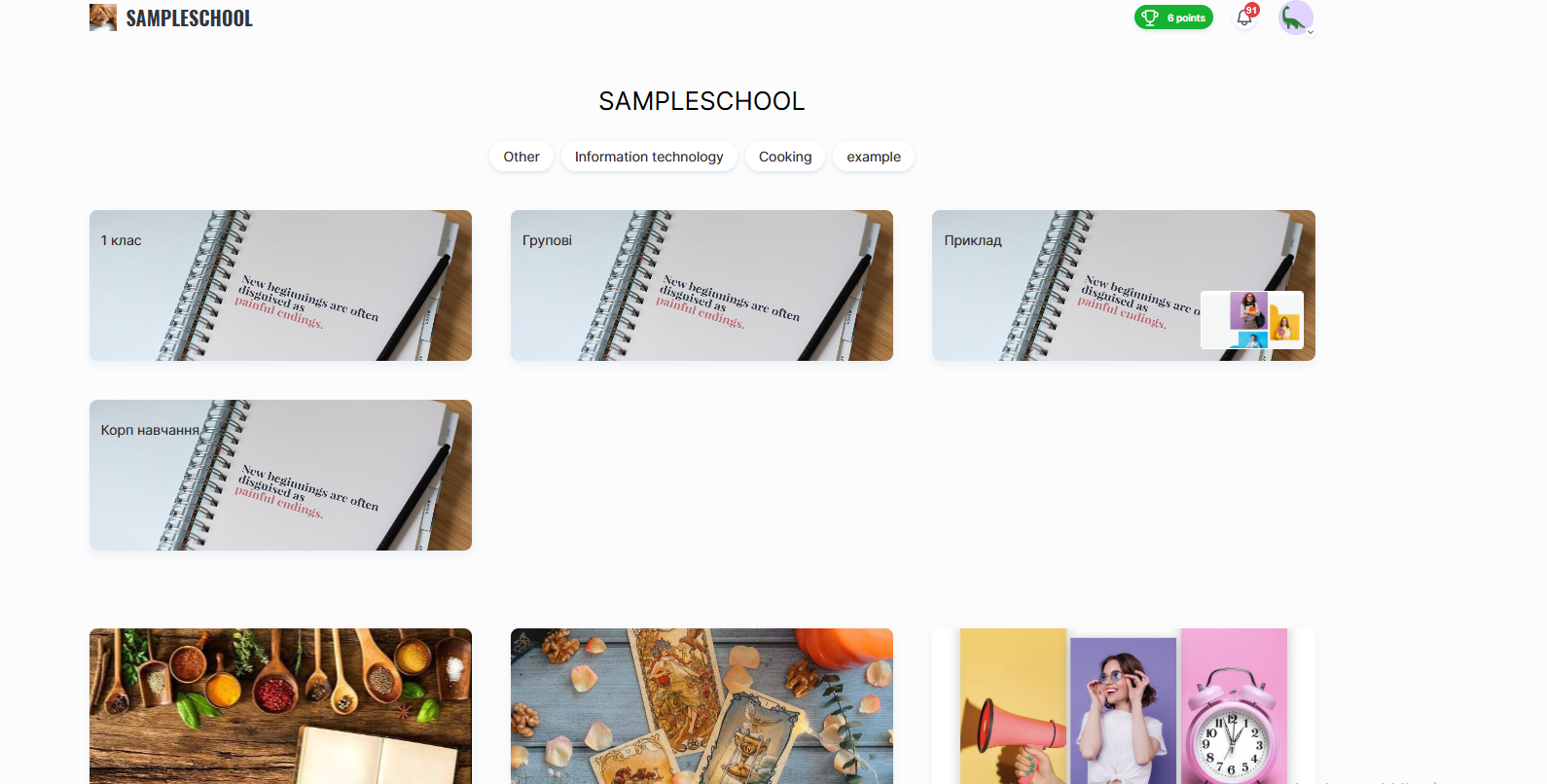
On the Kwiga platform, each educational project (school) receives its own presentation page. This is essentially the school’s main page, where published products are displayed.
The main purpose of this page:
● Collect all active courses in one place
● Provide students with a convenient catalog of learning materials
● Create a professional appearance for the school with a unique link in the format: schoolname.kwiga.com
For example: https://sampleschool.kwiga.com/
Thus, the presentation page can serve as the school’s main link, which can be placed on websites, shared on social media, or sent directly to students.
What Is Displayed on the Presentation Page
The presentation page is automatically generated based on the products that are created and published in the school and have open access. Only published courses, marathons, and private groups appear on it. If a product is not yet completed (a draft) or its access is restricted, it will not be visible to visitors.
You can also add folders to the page to conveniently group courses and marathons by topic.
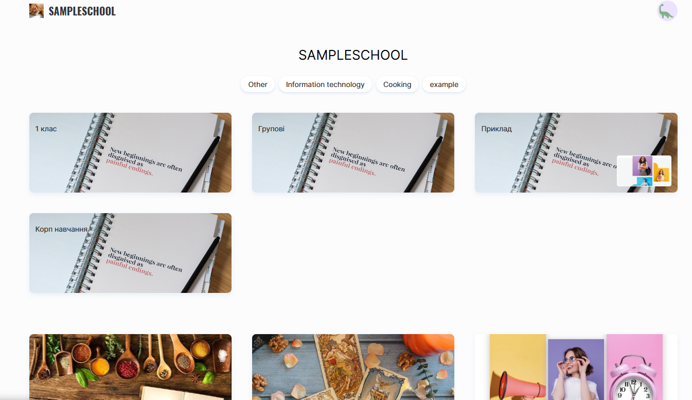
Each course or marathon is displayed as a separate card, which may include:
● Product title
● Number of lessons (updated automatically)
● Speaker’s name (can be edited or hidden in the product settings)
● Cover image (can be changed in the course settings)
● Tags and categories (if added)
The cover image can be changed in the course settings, allowing you to make the page more recognizable and visually appealing.
The presenter’s name can also be edited: in the product settings, you can change the displayed person or hide it completely, if the course does not require publicly presenting the author.
The number of lessons is updated automatically and reflects all published lessons within the product.
If tags or categories have been added to a product, they will also be visible on the page. This helps users find the right course more quickly and navigate among the school’s offerings.
Note: If a product has the status “Published” but does not appear on the page, check its settings — make sure the “Available in the product list” option is enabled.
How to Publish a Product and Add Tags or Categories
To make a product appear on the presentation page, it must be published and properly configured with categories and tags.
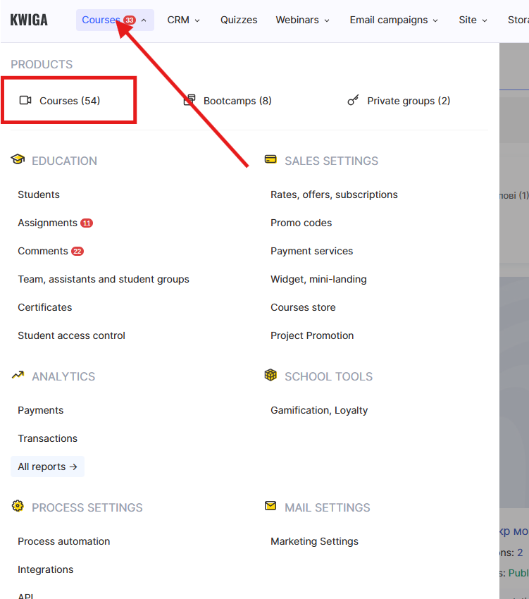
To do this, go to the Courses menu, find the required product, and open Course Settings on the Course tab.
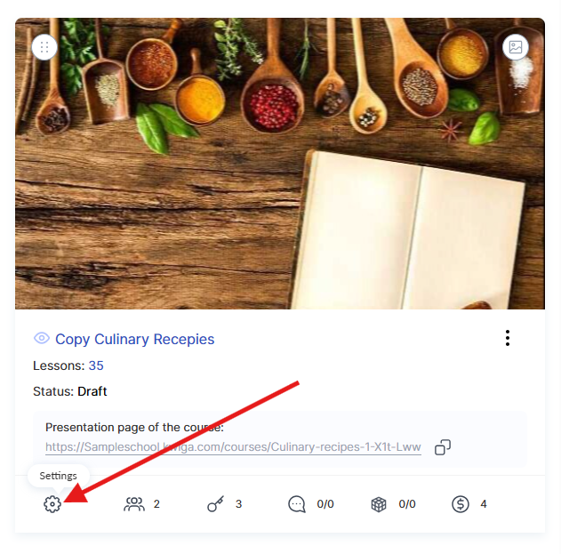
The course status must be set to Published — only then will the course become available to users. It is also important to activate the green Available in the product list toggle. If this option is disabled, the course will not appear on the school’s public page but will remain accessible via a direct link.
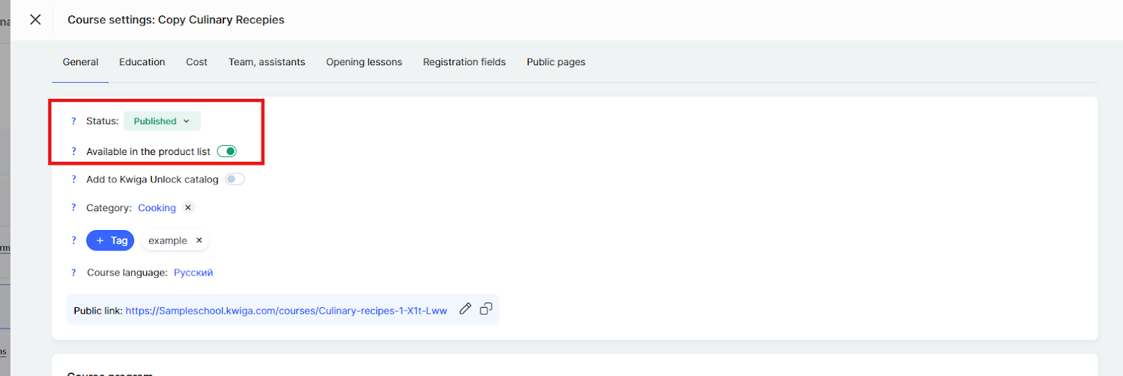
The category is displayed on the public course page and is used for filtering in the KWIGA Unlock course catalog. It represents the general field the course belongs to, such as design, marketing, or foreign languages.
Tags allow you to categorize the product in more detail and help users find courses faster using keywords. Tags are displayed on the public course page under the school’s name.
Correctly configuring the status, categories, and tags will make the course more accessible and recognizable to users.
How to Group Products into Folders on the School Page
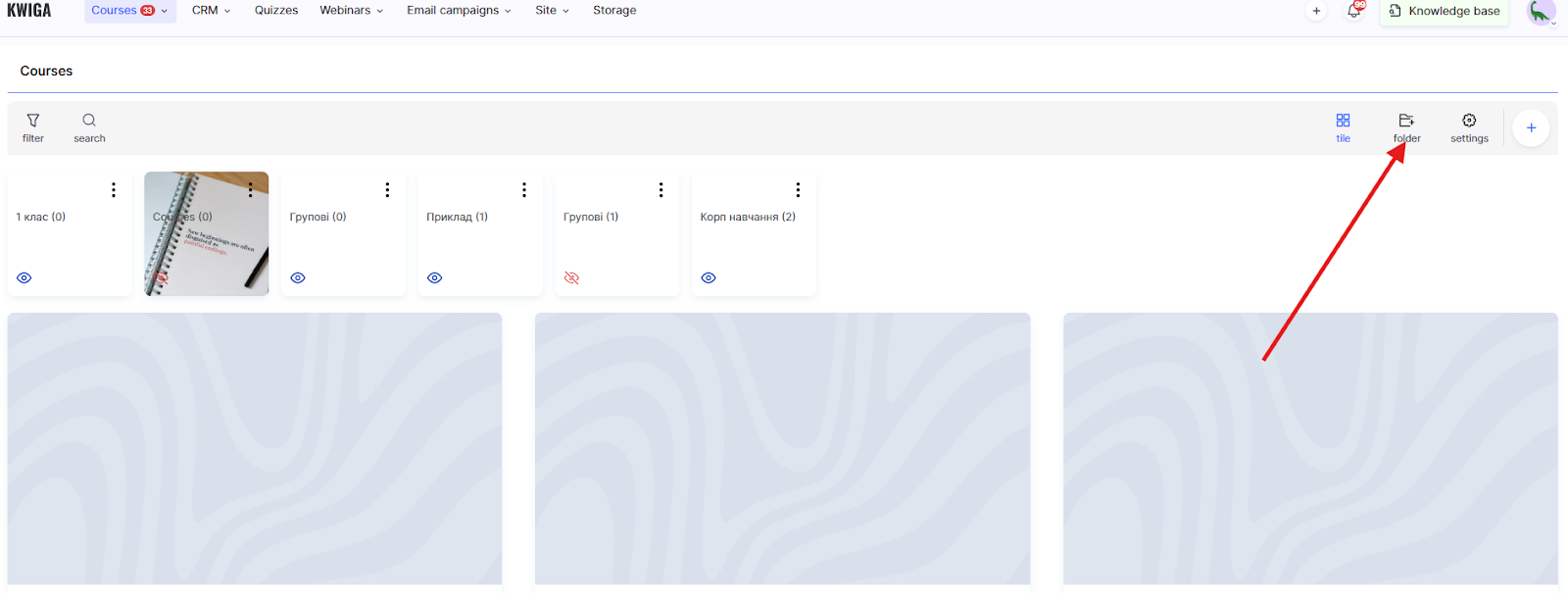
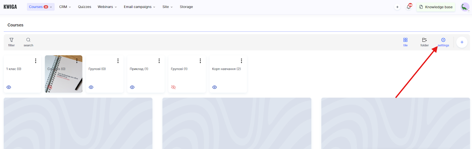
If you do not yet have folders, you need to create them. To do this, go to the Courses menu, open one of the sections in the Products block (for example, Courses), and click the +Folder button.
In the folder creation window, the following settings are available:
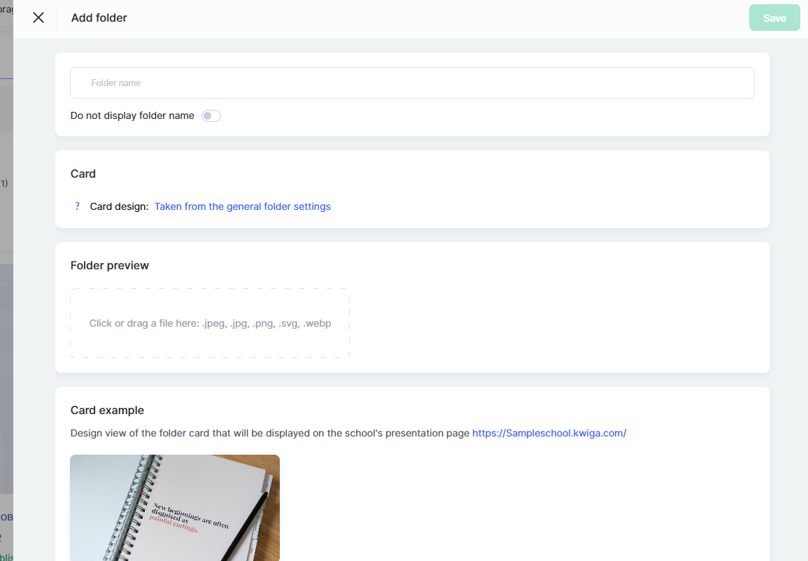
Folder Name — enter the name that will be displayed on the presentation page and in the administrative panel.
The Hide folder name toggle allows you to hide the folder name on the presentation page card, leaving only the visual design.
In the Card section, information about the folder card design is displayed. By default, the design is taken from the general folder settings. To change the overall design for all folders, click the Taken from general folder settings link.
In the Folder Preview section, you can upload a cover image for the folder. Supported formats: .jpeg, .jpg, .png, .svg, .webp. Simply drag the file into the designated area or click to select a file from your computer.
Below, the Card Preview is displayed — a preview of how the folder will look on the school’s presentation page with the selected settings.
When you finish editing, click Save.
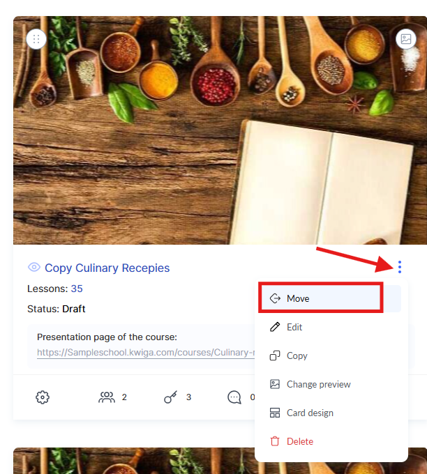
After that, you can add courses to the folder — to do this, select Move in the three-dot menu on the course card.
If folders have already been created and you want to configure how they are displayed on the project page or in the student dashboard, go to the Courses menu, open the required section of the Products block, and click Settings.
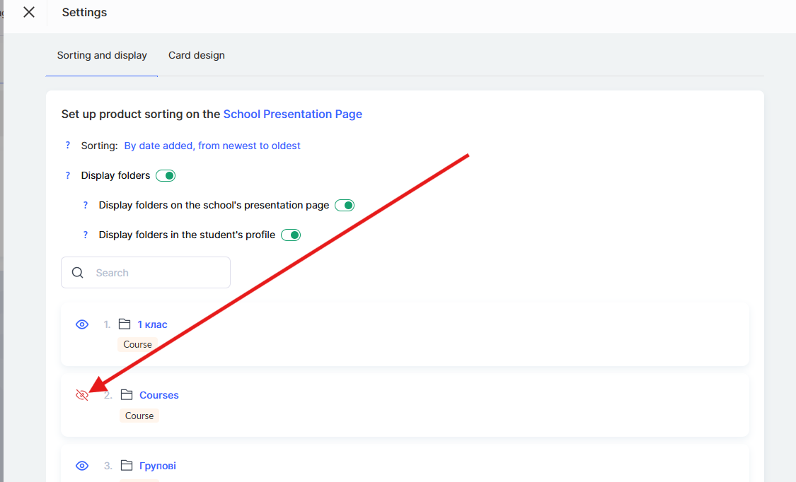
Here you can determine whether folders should be displayed and whether they should appear on the school’s presentation page using the corresponding toggles.
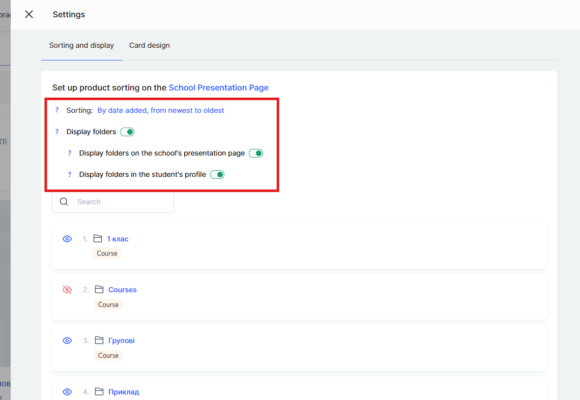
Below, a list of folders is displayed where you can change individual settings for each of them.
If folder display on the presentation page is enabled, you will have the option to hide any of them.
Depending on the selected parameters, the icon will change — this helps you quickly navigate, and the tooltip on hover will show which folders are visible to students and which are hidden.
How to Configure the Display Order of Products
The project owner or administrator can control which courses, marathons, or groups are shown on the presentation page. Only products with public access enabled and the Published status will be displayed.
The display order can be changed manually. To do this, go to the Courses menu and open one of the sections in the Products block, for example Courses.
Then open Settings.
Here you can sort products in a convenient order so that, for example, important courses or marathons appear at the top of the page. These settings apply both to students and to the administrative panel (in the expert dashboard).
Sorting options:
● By date added, from oldest to newest — courses are displayed in the order they were created, starting with the oldest
● By date added, from newest to oldest — the newest courses are shown first
● Set manually — allows you to change the display order of products manually 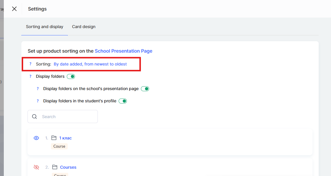
After the order of courses has been manually configured, all newly added courses will automatically appear either at the beginning of the list or at the end, depending on the selected sorting type.
If a course is temporarily not relevant or needs to be hidden, simply disable public access.
In this case, it will disappear from the page but will remain accessible to those who already have access to it.
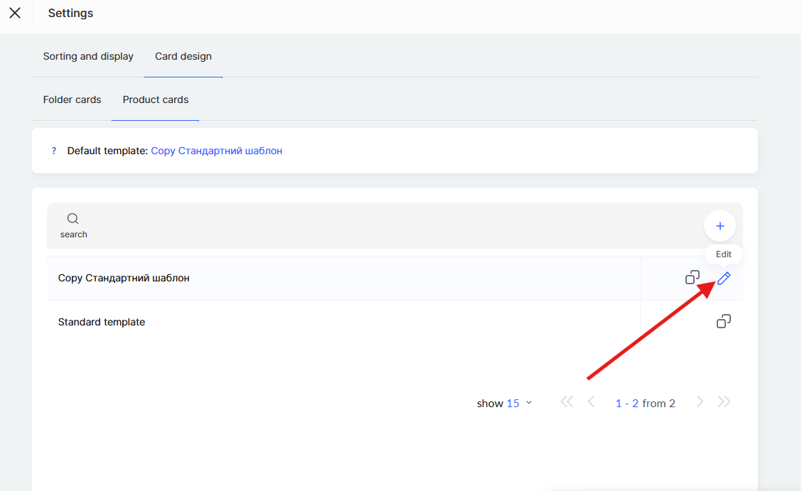
How to Customize the Design of Product Cards
The Kwiga platform allows you to create custom product card templates so that the presentation page matches the style of your school. You can choose which elements appear on the card, modify their styling, and create a unique visual appearance.
Note: Product card design settings affect how cards are displayed on the school’s presentation page and on the public course page. Here you can choose what information to show on the card (title, author, price, tags, etc.).
To configure the card design, go to the Courses menu and open the required section of the Products block (for example, Courses).
Click Settings, then go to the Card Design → Product Cards tab.
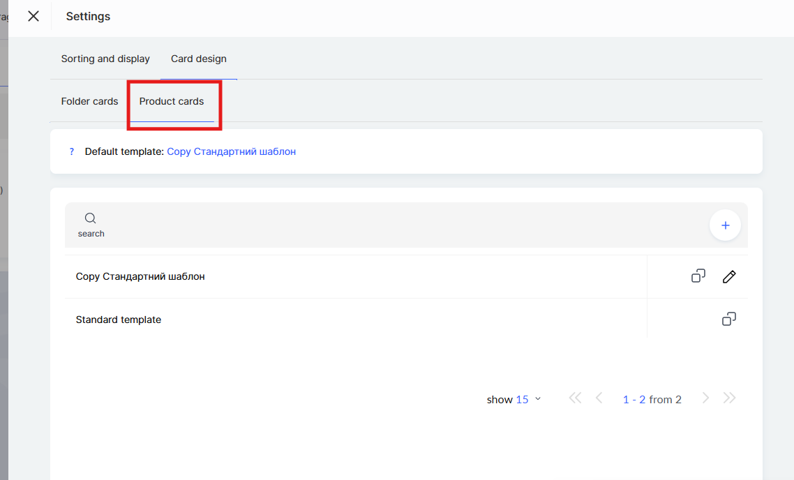
By default, the Standard template is available. You can copy the existing template and customize it to suit your needs, or create a new template from scratch. To create your own template, click + (plus) or duplicate the standard template.
General Card Settings
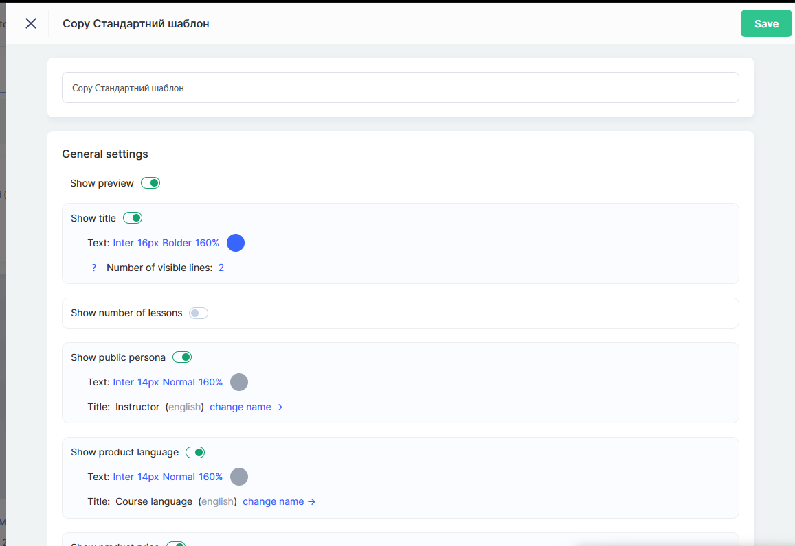
In the template editor, options are available for configuring the elements that will appear on the product card.
The Show preview toggle allows you to enable or disable the display of the product cover on the card.
The Show title option controls the display of the course or marathon title. You can adjust the text style (font, size, color) and the number of visible lines. If the title is long and you want to prevent the card height from changing, you can limit the title length by setting a fixed number of lines.
Note: If the text length exceeds the specified limit, the text will be truncated and an expand icon will appear at the end — clicking it will display the full text. To always show the entire title, set the value to Auto.
The Show number of lessons toggle displays information about the number of lessons in the product. You can also change the field name Lessons to a custom label if needed.
The Show public persona option adds the name of the course presenter or author to the card. You can customize the text style and change the field label (for example, replacing Presenter with Author or Speaker).
If Show product language is enabled, the language in which the course is conducted will appear on the card. You can also customize the text style and field name.
The Show product price toggle adds the course price to the card. Text style and field name settings are also available.
The Show tags and categories option displays the product’s tags and categories, helping users find the relevant content on the school page.
Card Appearance Settings
In the Card section, you can configure the visual parameters.
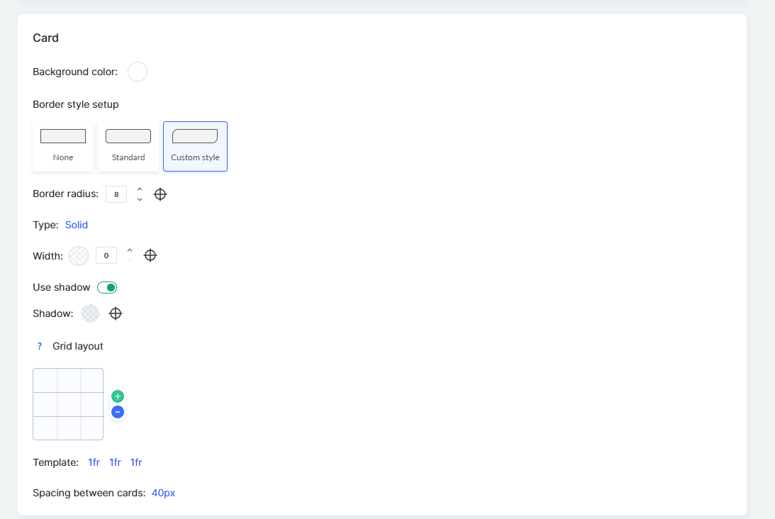
The Background color option allows you to choose the background color of the card. The Border style setting offers three options: no border, standard, or custom style.
The Corner radius parameter defines the roundness of the card’s corners in pixels. The Type option allows you to select the border type (for example, solid or dashed), while Thickness adjusts the border width.
The Use shadow toggle adds a shadow to create a sense of depth. In the Shadow settings, you can choose the color and display parameters.
You can also configure how cards are displayed in the grid. By default, the column width is proportional to the total number of columns, but you can create a custom layout.
The Template parameter defines how cards are arranged within a row. The Spacing between cards parameter sets the distance between cards in pixels.
Below, the Card preview is displayed in the editor — this shows how your products will appear on the presentation page with the selected settings. This allows you to see the result in real time before saving.
After completing the settings, click Save in the upper-right corner.
How to Customize Folder Design
In addition to product cards, you can also customize the appearance of folders on the presentation page. This allows you to create a consistent style for all elements of your school.
Important: Folder design settings apply not only to the school’s presentation page but also to the student dashboard — Specifically, on the Currently Learning and Completed pages. Changes will be reflected in all of these sections simultaneously.
To configure the folder design, go to the Courses menu, open the required section of the Products block, click Settings, and then go to the Card Design → Folder Cards tab.
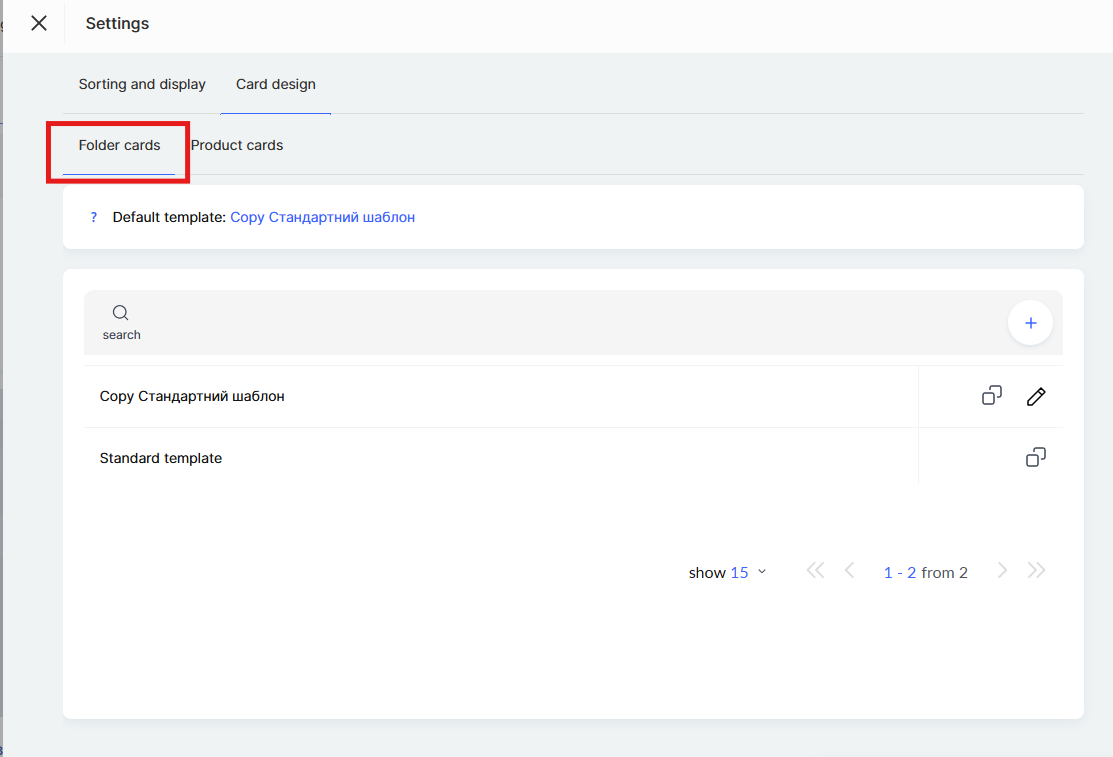
By default, the standard folder design template is available. You can copy the existing template and customize it to suit your needs, or create a new template from scratch by clicking + (plus).
In the template editor, you can configure how the folder name is displayed.
The Folder name option allows you to customize the text style of the name: font, size, weight (Normal, Bold), and line spacing in percentages.
The Show folder name toggle controls whether the name is displayed on the card. If this option is disabled, only the image will be shown on the card without the name.
The Number of visible lines setting limits the length of the name. If the folder name is long and exceeds the specified number of lines, the text will be truncated with the option to expand it.
You can choose the background type for the folder card — either an image or a color.
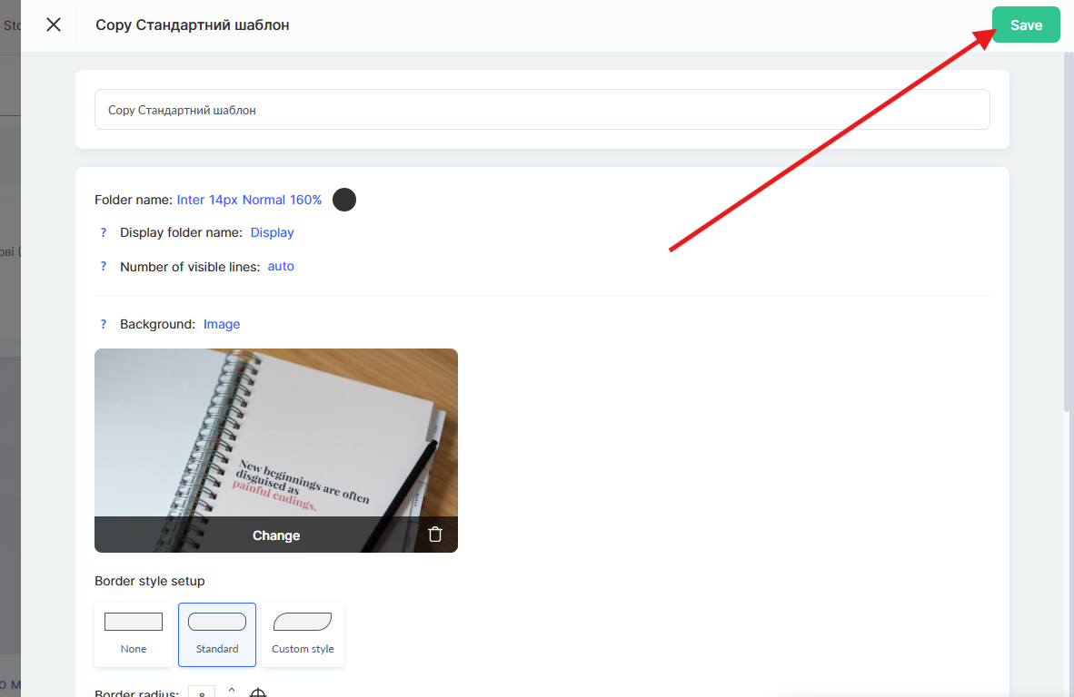
Below, a Folder Card Preview with the selected settings is displayed. This allows you to see the result in real time before saving.
After completing the settings, don’t forget to click Save in the upper-right corner.
How to Edit the Appearance of the Presentation Page
The presentation page displays the workspace name, which can be changed in the workspace settings. This helps make the page more personalized and recognizable for users.
Changing the logo or background is not yet possible — this feature is currently under development.
In the page footer, you can place additional information, such as contacts, links to the offer agreement, or the privacy policy.
You can learn more about this in a separate article.
Didn't find the answer? Contact the support service via online chat or Telegram