
Articles:
- Access control
- How to disable login through social media
- How to set your project logo (preview) for messengers
- Changing the project (cabinet) name and other public settings
- Adding your offer to the Kwiga platform
- How to connect an additional project
- How to set a specific language for a page on Kwiga
- Notifications received by students
- Changing the password and login settings
- Changing personal information
- Sender settings and reply address
- Important settings
- How to delete a user account
- Project (School) Presentation Page
- How to Bind Your Own Domain/Subdomain
- Using variables on the project, list of available variables
- Connecting a Custom Domain (Subdomain) for Sending Emails
- How to Add Public Project Information and Contact Channels
- Student Profile Settings
- White Label: customize the student dashboard design
Set up White Label for the student dashboard: customize the design, logo, colors, and other interface elements to match your brand style.
What is White Label?
White Label is a platform branding tool that lets you customize the appearance of the student dashboard to match your school's brand style.
With White Label, you can:
-
change fonts;
-
customize the colors of interface elements;
-
change the header design;
-
customize how the menu is displayed;
-
change the appearance of the student dashboard;
-
customize course and bootcamp pages;
-
change the course curriculum design;
-
customize how ratings are displayed;
-
make the platform interface more recognizable and aligned with your brand.
Using White Label lets you create a unified visual environment for students that matches your school's style and makes learning more comfortable.
White Label functionality is available on any plan Pay as you go, Growth, Pro, and Big Tuna. On the following plans: Pay as you go, Growth, and Pro using White Label is an additional paid option. For Big Tuna plan users, this functionality is already included in the subscription price and does not require an additional payment.
How to activate White Label
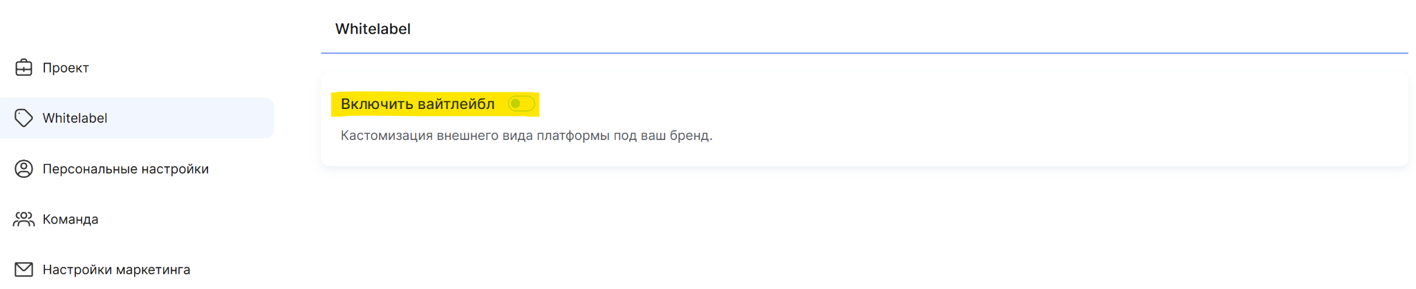
Go to the project settings (click your avatar in the top menu and select “All settings”), then open the White Label.
Enable the “Use White Label” toggle to turn on this feature and access the platform design settings.
Disabling Kwiga branding
In addition to customizing the platform's appearance with White Label, you can also disable Kwiga branding.
This feature allows you to remove platform branding elements from the following sections:
-
the Kwiga logo in emails;
-
the Kwiga mention in the footer;
-
Kwiga branding elements in the student profile.
The branding removal feature is available on all plans, but the terms of use differ:
-
on the Pay as you go and Growth plans, branding removal is a separate paid service;
-
on the Pro and Big Tuna plans, this feature is already included in the subscription price.
Please note: if you have activated White Label, no additional connection to the branding removal service will be required. This feature is already included in the functionality White Label.
Available White Label settings
White Label allows you to fully customize the platform's appearance to match your school's brand identity. The settings are grouped into sections, allowing you to change both individual interface elements and the overall look of the student dashboard.
Fonts
In this section, you can choose fonts for various platform elements:
-
Expert dashboard
-
Student profile
-
Course pages
-
Course landing page and presentation school
Page styling
Choose a background color for pages in the student dashboard.
Header


Header background color - you can change the color of the top panel in the student dashboard.
Stretch to full width - you can configure the header to display across the full width of the page.
Sticky header - you can pin the header so it remains visible while scrolling the page.
Shadow - you can add a shadow below the header to visually separate it from the page content.
Header padding - you can change the spacing between the header content and its edges.
Logo - you can change the logo size, adjust the roundness of its corners, and set the spacing between the logo and the school name.
School name - you can change the font size, weight, line height, and color of the school name.
Letter spacing - you can adjust the spacing between letters in the school name.
Points button color - you can change the color of the button that displays the number of accumulated points.
Hide the word “Points” on the button - you can configure the button to display only the number of points without additional text.
“Sign In” button color - you can change the color of the account sign-in button.
Show language switcher - you can enable or disable the ability to change the interface language.
Do not hide the school name on mobile - you can configure how the school name is displayed in the header on mobile devices.
Student navigation
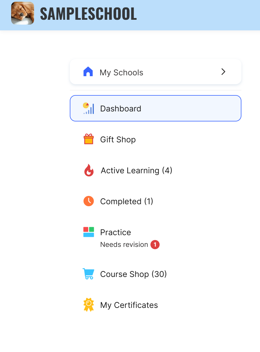
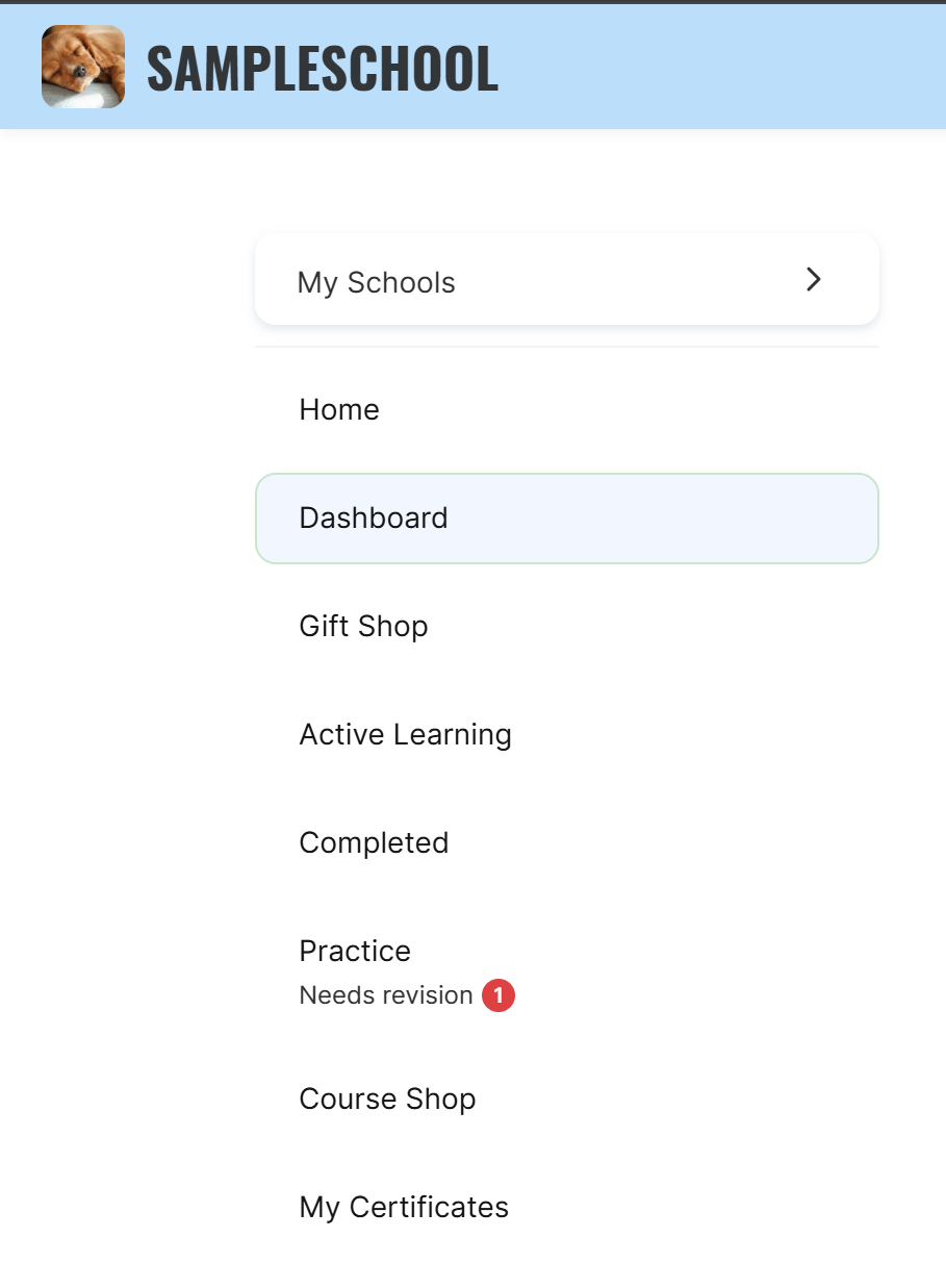
Active item outline - you can customize the highlight color of the active menu item to make it easier for students to navigate.
Hide the number of products in the menu - you can hide the number of courses, bootcamps, and closed groups displayed next to menu items in parentheses.
Hide student navigation in the “Hamburger” menu on mobile - you can change how the menu is displayed on mobile devices and hide navigation in the “Hamburger” dropdown menu.
Link to the home page - you can add an additional “Home page” item to the student menu that leads to the school's home page.
Menu icons - you can choose one of the available options for displaying icons in the student menu. If you want to use custom icons, contact support.
You can also rename menu items, configure how they are displayed, or hide unnecessary sections. Read more about these settings in the article.
Student menu (in the header)
The settings for this item allow you to change the appearance of the header menu that opens when you click the avatar. Two options are available: standard and compact.
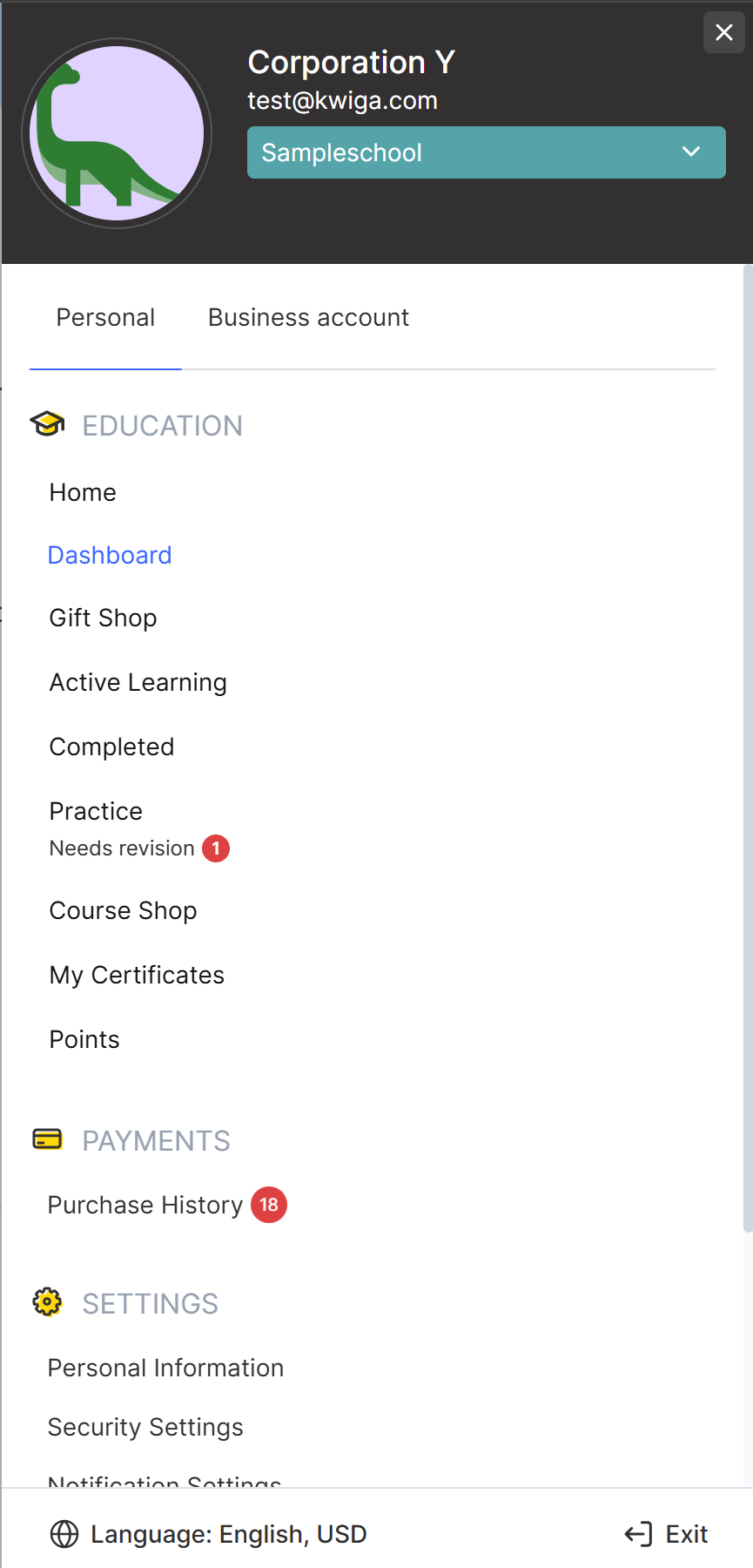
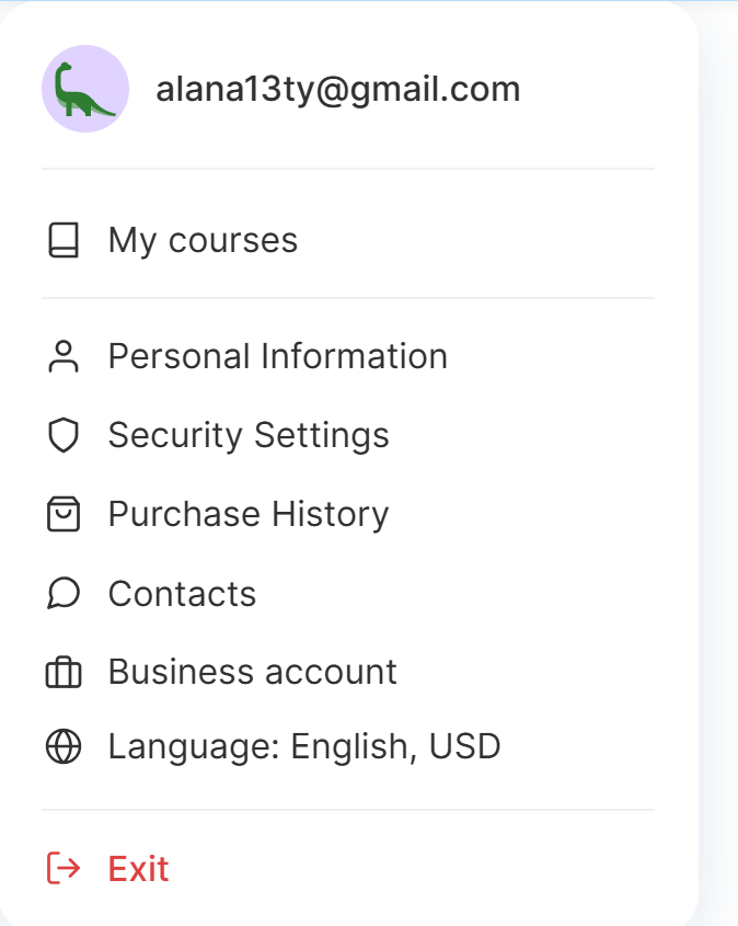
Menu template - you can choose how the student dropdown menu is displayed. Additional settings become available when using the compact template.
Show the “Business account” tab - you can add an additional tab to the menu that allows students to quickly go to an existing project of their own on Kwiga or create a new one.
Show menu item icons - you can enable or disable the display of icons next to menu items.
Show language switcher - you can add the option to switch the interface language to the menu.
Show currency switcher - you can add the option to switch currencies to the menu.
“Log out” button color - you can change the color of the log out button.
Notifications
Show the notification bell in the header - you can enable or disable the display of the notification icon at the top of the student dashboard. If you disable this feature, students will not see internal platform notifications.
Student dashboard
Dashboard template - you can choose how information is displayed on the student dashboard home page. Standard and compact templates are available.
Progress color - you can change the color of the indicators that show learning progress for each course.
“Actively learning” page
Page title - you can change how the “Actively learning” page title is displayed, as well as configure the font size, weight, and line spacing. You can change the name of this page in the project settings.
Corner rounding - you can adjust the corner rounding of buttons and product cards.
Show filter - you can enable or disable the product filter panel on the learning page.
Show search bar - you can enable or disable the search bar so that students can find the courses and bootcamps they need faster.
Search bar alignment - you can choose the position of the search bar on the page.
Progress bar color - you can change the color of the learning progress indicator for courses and bootcamps.
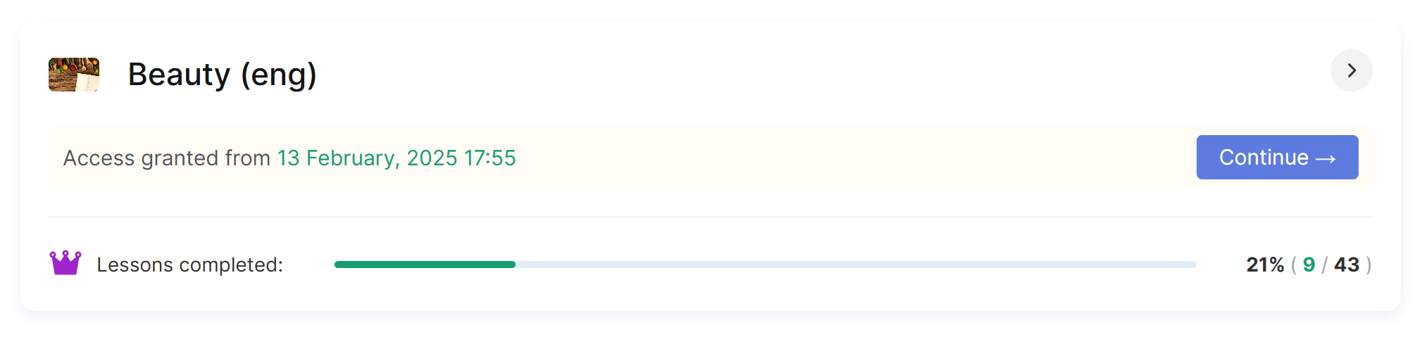
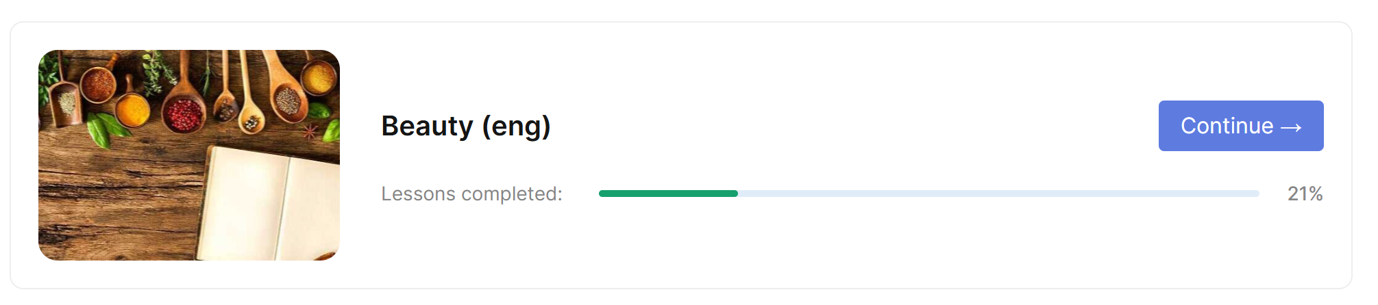
Product display - you can choose how product cards are displayed on the “Actively learning” page.
Page template - you can choose one of the available page designs for the “Actively learning” page: standard or with expanded course card display. Below is an example of the standard and expanded display for 1 course:
Leaderboard
Page template - you can choose a design option for the leaderboard page. Standard and compact templates are available. When selecting the compact template, you can also choose a color for leaderboard elements.
Leaderboard color - you can change the color of leaderboard elements. The selected color will be used for first place, while the system will automatically select matching shades for second and third places.
Course/bootcamp page
Flat progress indicator (without expanding) - you can enable a compact display of the “My progress” section and hide additional information.
Progress indicator color - you can change the color of the progress indicator on the course or bootcamp page.
Course program
Lesson status icons - you can upload your own icons to display lesson statuses. One image can be used for multiple statuses at the same time, such as “Completed,” “Not completed,” and “In progress.”
Show status icon for module - you can enable the module status display next to its title. Standard platform icons or the lesson status icons you uploaded will be used for this.
Bold module titles - you can make module titles bold to visually distinguish them from lessons.
Dividers between lessons within a module - you can enable dividers between lessons to make the course structure easier to understand.
Active lesson background - you can change the color of the lesson that is currently open or selected.
Simplified program page - you can enable a simplified course program display mode on mobile devices. In this mode, only the school logo and name will be displayed at the top of the page.
Didn't find the answer? Contact the support service via online chat or Telegram