Articles:
- How to delete a course
- Copyright protection of your content on Kwiga
- Public or trial lesson
- How to change the status of a lesson to draft and hide it from students
- Usage of checkpoints
- How to add an assignment to a lesson
- How to create a task with mandatory review by an assistant
- How to create a task for different offers
- How to create a test with scores and automatic approval
- How to create and conduct a quiz among students on the course
- Downloading video files
- Contents of the lesson, all types of activities in the lesson
- How to add time codes to the video
- How to add button to the lesson
- Inserting iframe code
- Adding fractions, mathematical functions, formulas
- How to add text with spoiler to the lesson
- How to create a course on the Kwiga platform
- How to create a marathon
- How to add a cover to a course
- Course Program Display Options
- How to add a public face to a course
- How to add a team to a course
- Course preview with different access levels
- Setting delays, schedule for opening and closing lessons (dripping content)
- Block above the lessons (top banner)
- Report on student progress on the course
- Analytics of assignments completion on the course
- Course sales report
- How to create a copy of the course
- How to copy lesson content
- Assistant’s Access to Practical Assignments
- How to Create a Contact Collection Widget
- Student Can't See the Course (Marathon, Closed Group)
How to create an effective contact data collection widget: setting up fields, multi-step forms, applying data, and publication options.
In this article:
A contact form is a key tool for building long-term customer relationships. With it, you can collect email addresses, phone numbers, social media links, or any other data needed for effective communication. In this article, we’ll show you how to create a widget on the platform easily.
Creating a Widget
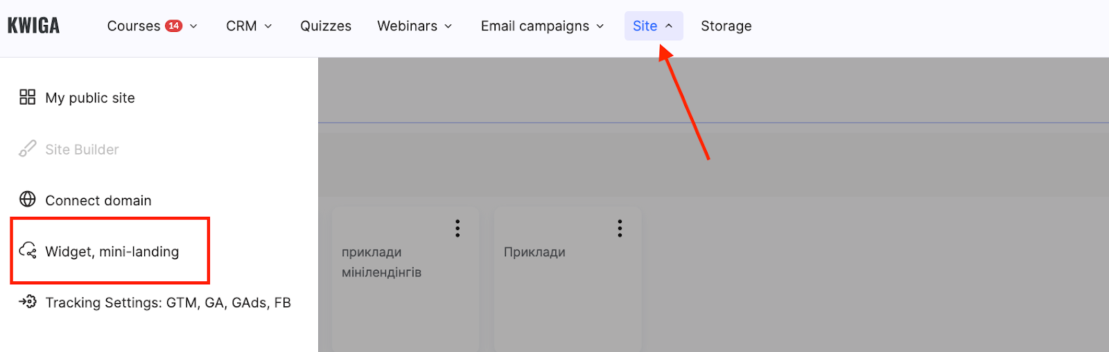
Go to the menu Site → Widget, mini-landing.
Click the + button to create a new widget.
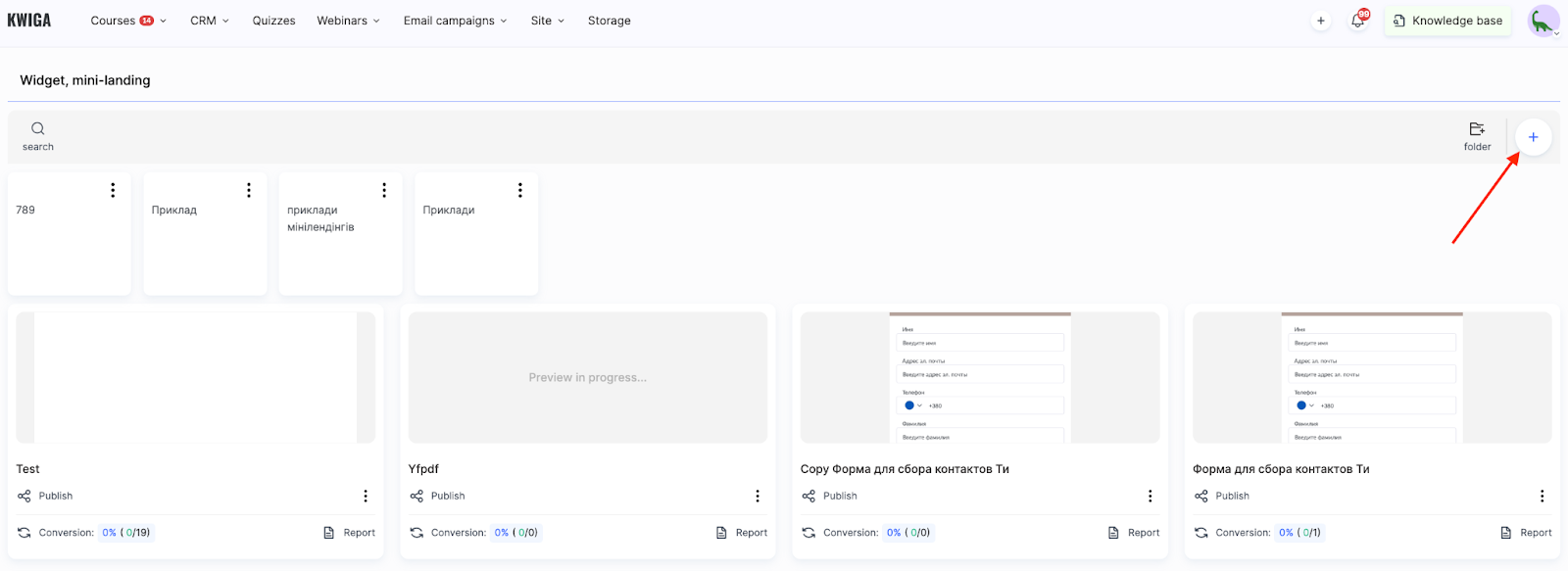
Enter the widget name and click Save.
This will automatically create a basic form with an email input field. This field is required because it is used to log in to the platform as a user.
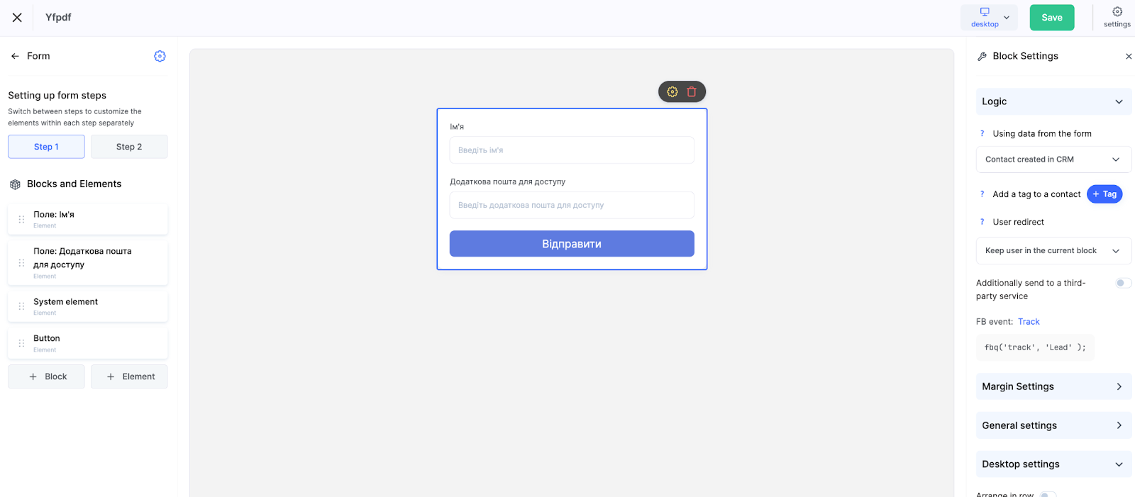
What the editor looks like:
-
Central section — displays the form and its appearance
-
Left panel — available elements to add (buttons, fields, images, etc.)
-
Right panel — settings for each selected element
This interface lets you quickly change the form structure, add new fields and components, and tailor it to your goals.
How to Configure Fields and Steps in the Form
To configure the form, click on it to select it.
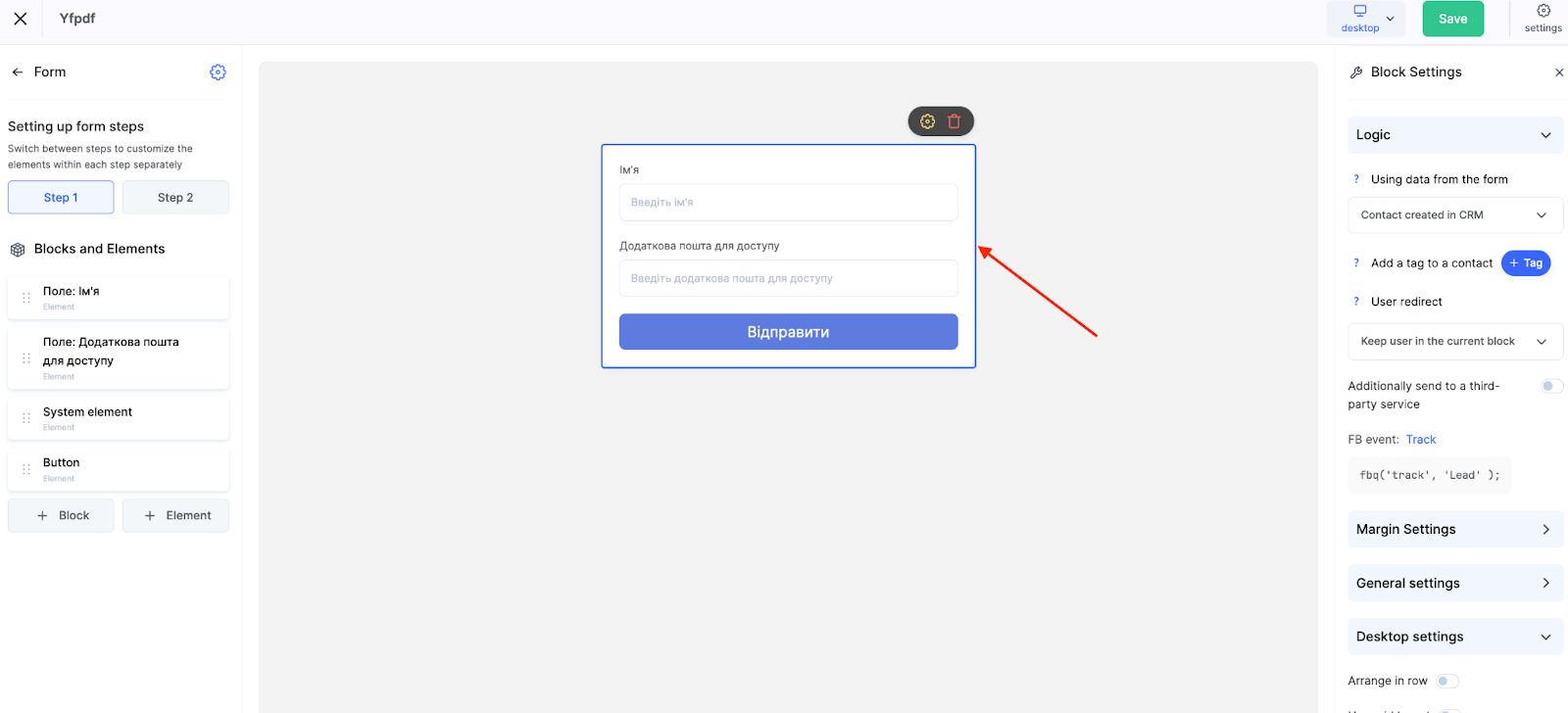
Then click + Element on the left sidebar. Choose the desired field type or additional element.
From the list, you can add not only contact fields but also other functional elements:
-
Button – to trigger additional actions, such as redirecting to another page
-
Image – for design or visual emphasis
-
Link – to add external or internal redirects
-
Timer – to limit time or create a sense of urgency
-
Social media – buttons with Facebook, Instagram, Telegram icons, etc.
-
HTML – insert your own code
-
Title and Description – for text instructions or explanations
-
YouTube and Vimeo – for embedded video
-
Contact fields (name, phone, city, etc.)
Note: Fields added to the form are automatically saved in the user’s card in the CRM. You can use both standard fields (name, email) and create custom ones.
If you need to collect additional data not included in the standard set, you can create custom fields in the CRM settings — more on this in a separate article.
This allows you to tailor the form to specific tasks: collecting phone numbers, social media links, meeting dates, job titles, lead sources, and any other information relevant to your customer interaction.
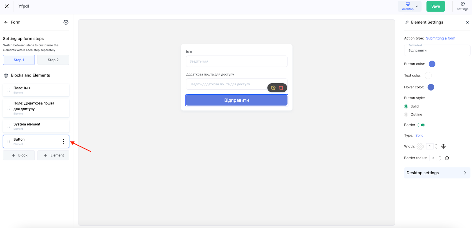
Multi-Step Forms: Why and How?
If the participant doesn’t need to be redirected to a payment or another page after completing the form — for instance, if it’s just a contact collection form — you can configure a second step in the form.
You can add up to 2 steps. Switch between them to configure each step’s content separately.
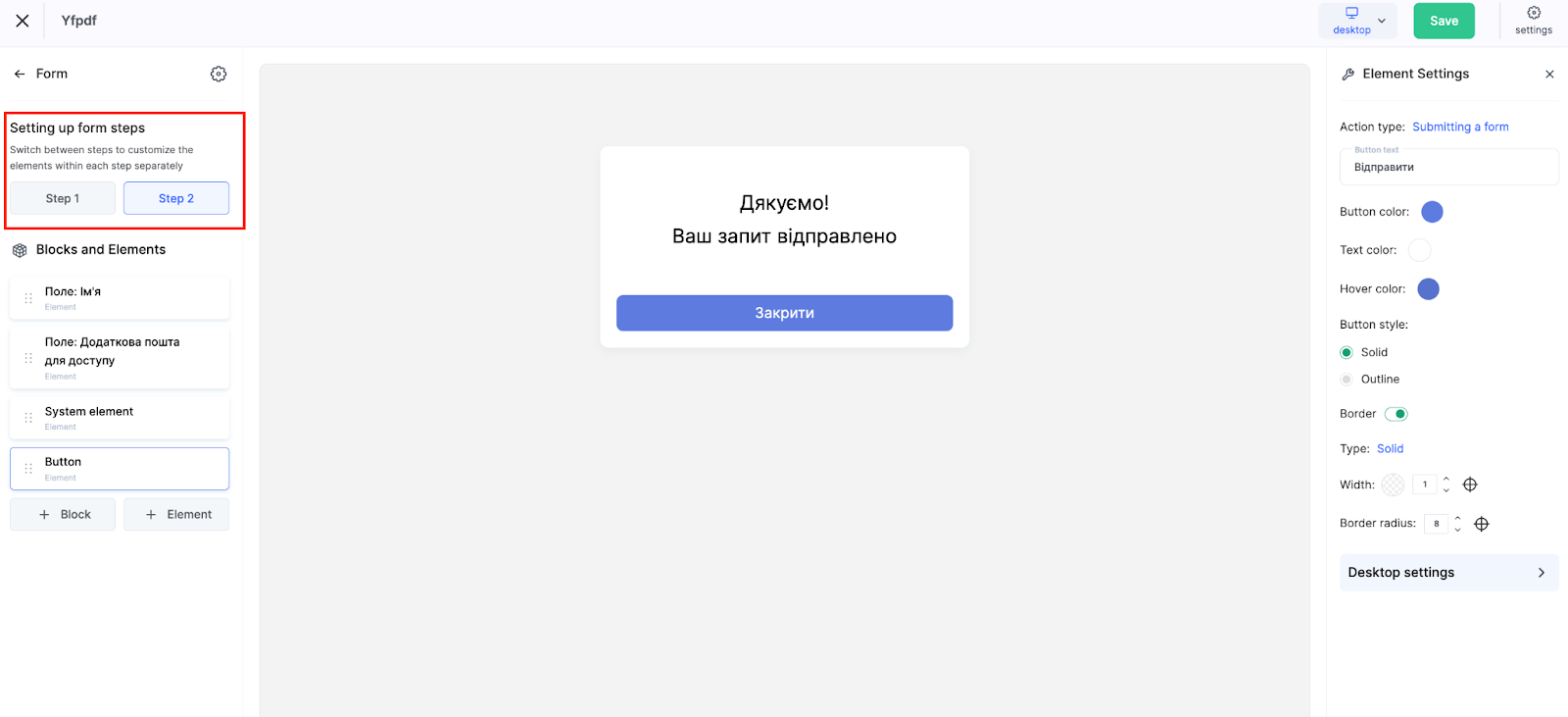
This is useful when displaying a confirmation or additional info after the first step. The second step often includes a short message like "Your request has been received," a "Close" button, or a link to additional material — for example, a Telegram channel or checklist.
Logic: Applying Form Data
To configure how the form data will be used for contact collection, select the form in the central part of the editor and go to the Logic section in the left panel.
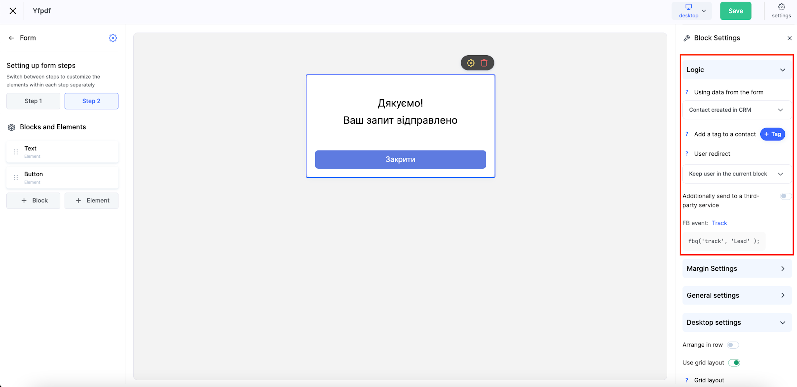
This section defines what happens after a user clicks the button in the form:
-
Contact created in CRM – The form data automatically creates a new contact in Kwiga's CRM.
-
Access to product – A contact is created in the CRM, and if access is granted to a course or product, the user is authorized and redirected to payment or the course page.
-
Deal – Alongside creating a contact, an agreement is immediately created in the specified pipeline and stage.
-
Sent to external service – Using a Webhook, the data can be sent to external systems — such as a third-party CRM, chatbot, or another service.
An additional personalization feature is the automatic tagging of new contacts. After submitting the form, the system can assign specific tags to the contact, simplifying further segmentation and filtering in the CRM. For example, you can automatically label contacts by source, interest in a particular product, or any other criteria critical for your marketing strategy.
After submitting the form, you can choose to:
-
Stay in the current block — Show the second step of the form with a confirmation message
-
Send to profile on Kwiga — Automatic login and redirect to the user's profile
-
Redirect to page — Redirect to a specified URL
Note: You don’t need to insert a payment link manually—this is automatically set up via the "Access to product" option.
Configuring Form Blocks and Elements
Beyond logic settings, the right panel provides additional blocks to style the form according to your needs.
Margin Settings:
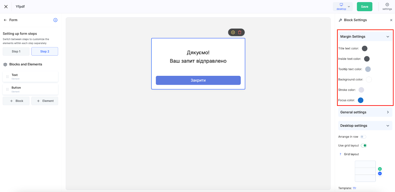
-
Text color for labels, placeholders, and input text
-
Background and border colors
-
Focus color
General Settings
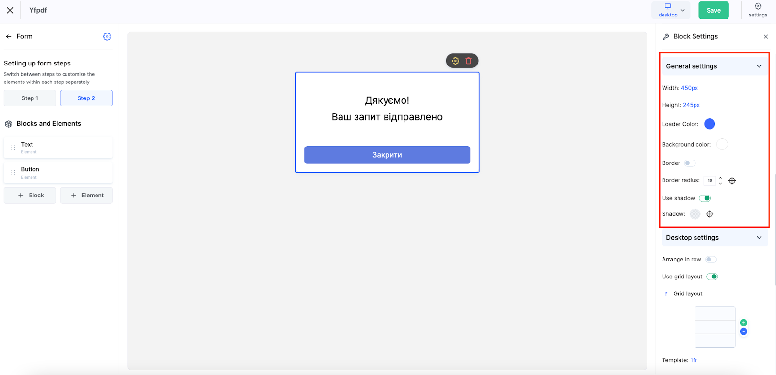
-
Width and height (in pixels)
-
Loader and background color
-
Border settings
-
Corner rounding
-
Shadow use and configuration
Desktop Settings
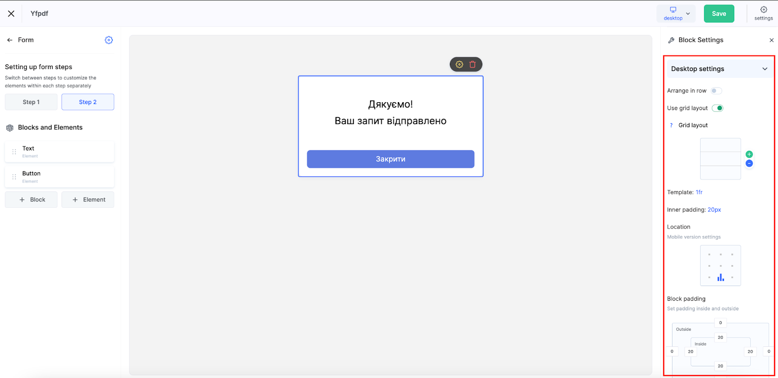
This block lets you adapt the form’s appearance for larger screens to ensure proper alignment and seamless integration into your page. Available options include:
-
Inline layout – Horizontal alignment for compact forms
-
Grid layout – Use of a flexible grid system. Example: 2fr 1fr means the first column is twice as wide as the second. You can define sizes in fr (fractions), px, or %.
Rows wrap automatically, keeping the layout tidy regardless of the number of elements.
Spacing Between Elements:
Adjust the internal spacing between form components to ensure readability and avoid clutter.
Alignment:
Extra settings allow you to align the form on the mobile page—left, center, or right—depending on your design choice.
Block Padding:
This controls both internal and external padding of the form block. You can define top, bottom, left, and correct values separately for better integration into your layout.
General Widget Settings and Publication
Once the form is created and configured, it needs to be prepared for publishing. In the upper-right corner, click Settings to find key options to finalize your widget.
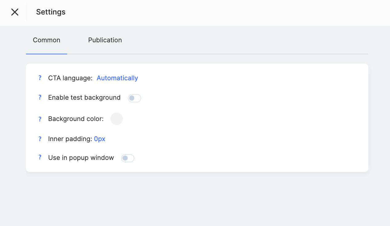
CTA Language – This setting localizes the text elements in your form. When set to Automatic, the system determines the user’s language based on their browser settings or geolocation, providing a better user experience for a global audience.
Enable Background for Testing – This helps preview your widget's appearance on a non-white background. It’s useful for testing, but note that this background is only visible in the builder, not on the live site.
Use in Modal Window – Enable this option if you plan to show the widget in a pop-up (e.g., after clicking a button).
Under the Publication tab, you can copy the widget code to embed it directly into your page.
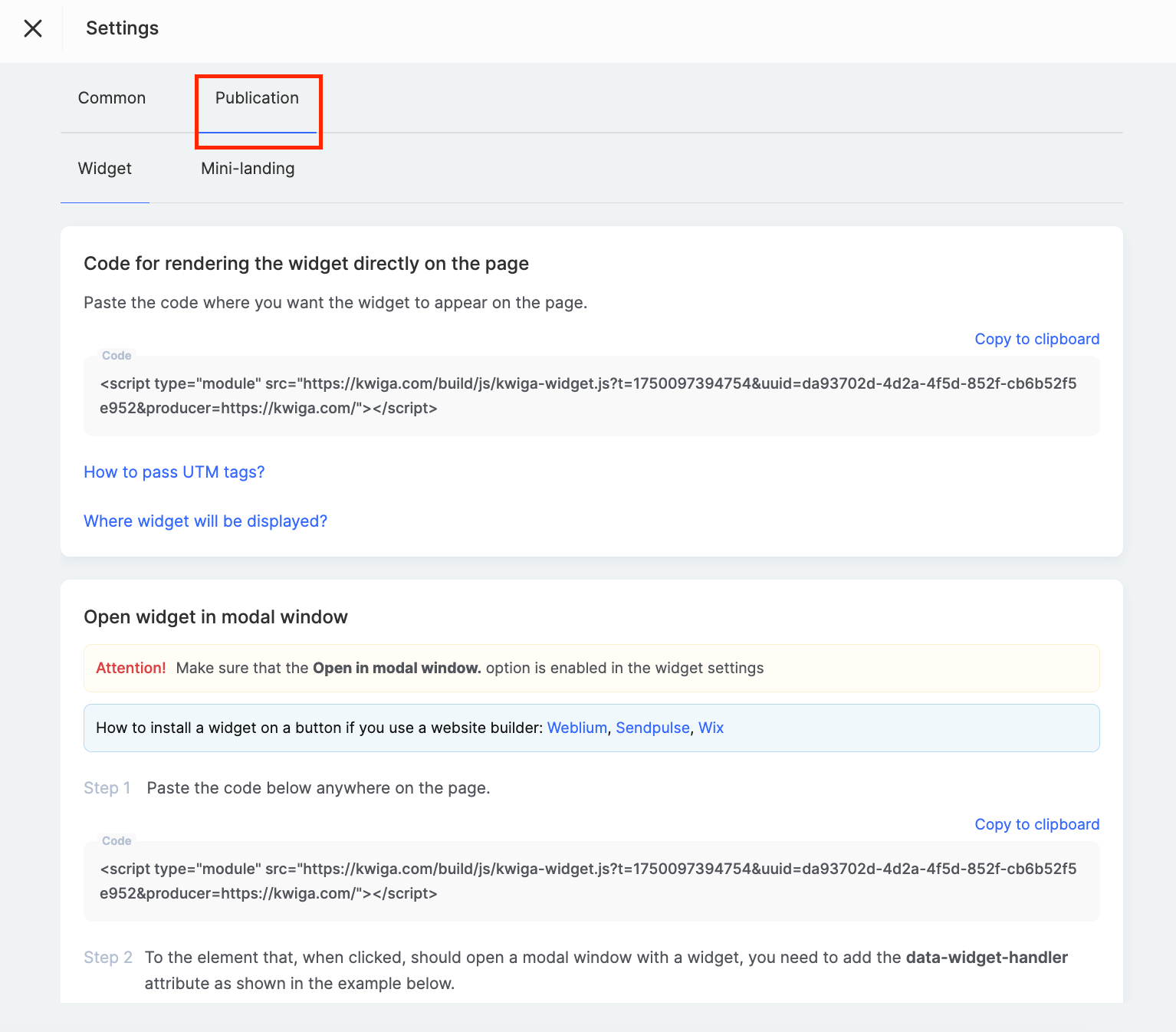
Simply paste the code where you want the form to appear.
Instructions are also available for adding the widget to popular website builders like Weblium, SendPulse, or Wix.
Thanks to the platform’s flexible settings, you can create a form perfectly tailored to your business needs — from simple email collection to complex multi-step scenarios with CRM integration and automated deal creation.
Didn't find the answer? Contact the support service via online chat or Telegram